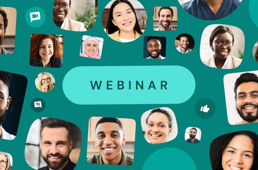
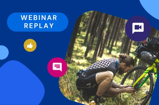
When it comes to reporting, context is essential.
For those immersed in the digital side of a business the metrics covered in a standard web report may be second nature, but for the wider audience it might be hard to quantify how good or bad a certain value is. Sure you can compare with last month, or last year, but doing better than last month isn't always the same as doing well.
One way to add some additional context to your Data Studio reports is to look at performance against a target.
Here is an example report we’ve created showing performance against a target for three key metrics:

This report is intended as a wall board that updates daily to show progress against targets, but the same concepts apply if you wanted to simply have a % of target field added to a monthly report.
All we need to do to bring a target comparison into a report is create a calculated field with our metric divided by our target:

We then used that new metric in a bar chart:

Even though we want to look at just the metric in our bar chart we need to specify a dimension, so we’ve just created a calculated field to get an “All users” dimension. There’s a number of ways to do this but here’s how we’ve done it:

So now we have a single bar chart that looks something like this:

We fluff around with the display settings a bit, turn off the axis labels and legend, overlay some labels of our own, add the overall metric count at the top and add our dashboard styles to the page and we now have our nice little scale that will fill up each time the data is refreshed to show the current progress against the target.

This is just one use case for targets in Data Studio but once you've created that simple calculated field it can be incorporated in many ways. If you have any questions just let us know using the form below.