16 Apr 2024
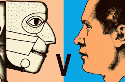
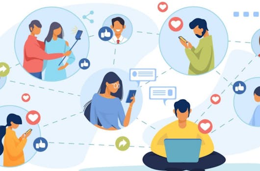
Top 5 ways AI is Reshaping Website Personalization
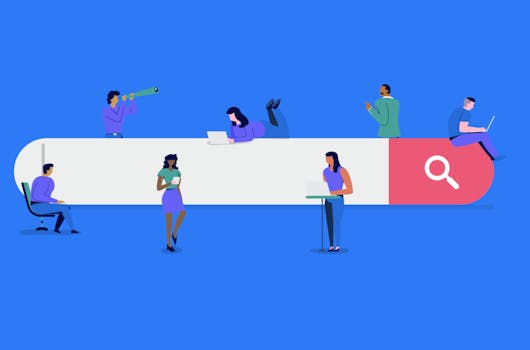
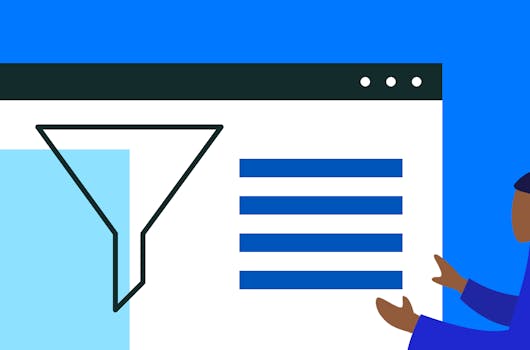
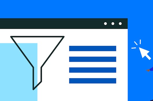
Ever wondered how some websites seem to magically tailor their content and recommendations just for you? Well, let's talk about how AI is making that happen and why it's such a game-changer for online personalization.
Read Article