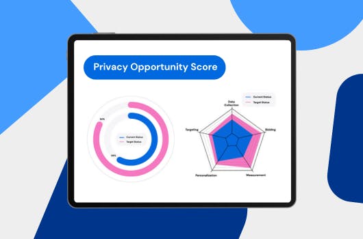
Pivot tables are my preferred method of presenting scroll depth, due to them being easy to create and the most effective way of reporting insights.
Pivot tables offer us the ability to visualise scroll depth data of every page with a grand total of your website. Whereas, when using scorecards and bar charts we are limited to visualising the grand total of scroll of depth data across your website.
So forget bar charts and scorecards. Think Pivot Table Minimal Effort Maximum Insights!
If you've gotten this far and realised you don't have scroll depth tracking then read my other blog Adding Scroll Depth Tracking with Google Tag Manager to learn how.
Lets get started with a new Data Studio dashboard, and add ourselves a Pivot Table to show Scroll Depth tracking.
Step 1: Select the Pivot Table option from the insert tab.
Step 2: Set your Row Dimension to Page, Column Dimension to Event Label and your Metric to Unique Events.
Step 3: Add a filter where the Event Category is equal to your GTM tag Scroll Depth.
Step 4: Go to the style option of your pivot table and add a Heat Map to your Metric #1 with the colour green.
Output:
Now you have an easy-to-read pivot table that represents the scroll depth of every page on your website. It’s perfect for websites with blog posts or articles, as scroll depth allows for further insights into user behaviour. This pivot table allows you to see poor performing pages and show areas where user experience can be improved.
Congratulations! You’ve learned to visualised scroll depth data in the most efficient way.